 Post:
Post: Mac OS X annoyance
Disclaimer: despite pointing out something I don’t like about Mac OS X, I still think it’s a wonderful operating system. And Windows is still crap.
This annoyance concerns the Apple menu (which itself is a silly name: would be like Windows having the ‘Microsoft menu’). For reference, here’s a screenshot of the ‘mighty blue Apple’:
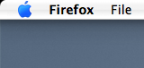
Happily, this button (and, in fact, the entire menu bar) was designed with some consideration of Fitts’ Law, which essentially boils down to “the bigger a target and the closer it is, the easier it is for users to get a lock on it”. The menu bar uses the “mile-high menu” corollary of this, in that if you put something at the edge of the screen it is, in practical terms, infinite in size, hence users can just slam their mouse upwards/downwards/sideways and get there. In the case of the Apple menu, this target area is infinitely high and infinitely wide, hence users can slam their pointers up and to the left with gay abandon and be sure of hitting their target. This makes them happy users.
Unfortunately, this is where we run into a problem, as shown when the menu is actually activated:
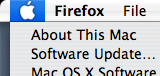
As you can see, the highlight around the menu doesn’t extend to the left-hand side of the menu, so users (such as myself) don’t know that the target area is not only mile-high, but mile-wide as well (which Google tells me is an area of 2,589,988.11 m²). This is an especially serious problem as, when the user will usually be coming at the menu from an angle closer to the horizontal than the vertical, the effective ‘size’ of the button depends more on its width than its height, more or less nullifying the mile-high–ness of the target and forcing the user to spend rather longer than they would like getting their mouse into position.
In short, uncharacteristically poor design decision from Apple, especially as they do the same thing with the Spotlight menu in the upper-right of the screen. Apologies if I’ve spent too long labouring the point, but it does raise the important issue that user interface enhancements are only useful if the user is made aware of them.
I’ll open this up to the floor now – comments?
It’s probably just as well that you got Tiger and not Panther then. Before Tiger, you had to click specifically on the Apple. No Fitt’s Law loving or anything.
It may well be the fact that this (important) enhancement is new that the graphics design doesn’t tie in. Though, curiously, the earlier screenshots of the Tiger theme have those funny blue “shoulders” on the menu bar which, one presumes, would have highlighted completely. I think they changed it back to the old look quite late in the process for some kind of familiarity reason.
“This annoyance concerns the Apple menu (which itself is a silly name: would be like Windows having the ‘Microsoft menu’).”
The menu is embodied by an Apple symbol. What rather unintuitive name would you rather accompany it?
Is having a Start menu (which is also used to shutdown the computer) better?
As for the actual topic, I didn’t think much of it (not really worth getting worked up over). Perhaps Apple thought it was aesthetically inferior to have the entire clickable region change color (guessing).
I think the broader point you’re making is a good one, Fatty, about the nature of accessibility and usability. I’m not about to criticise Apple as I’m sure there are many such instances in both computing and the real life where the point your making is evident. Interesting example you picked, though.
As for the Microsoft’s ‘Start’ menu, Derik, I think it’s name is simply intended to connotate that it’s the starting point (for most users) to access the range of options and services available on their computer. As such, shutting down and logging off from the start menu isn’t as antithetical to the ‘Start’ name as it may at first seem.
Speaking of which, and this is a genuine question, does the Mac OS have a icon, or symbol, which is synonymous with it? With Windows, obviously, it’s the Windows icon but this is distinct from Microsoft’s own corporate branding. With the Mac OS, though, I personally just tend to think of the Apple icon but this is in fact Apple’s logo, right? Is having this merged connection between brands and products, do you think? Does the iPod feature the Apple logo in a similar role?
*You’re, sorry
Apple’s individual products don’t tend to have such important logos, I don’t think. OS X has, since it’s birth, used a nicely rendered large “X” character on the box, which has altered a little with each point release. It’s not as big a deal as the Windows logo, though.
I’m with Derik as to to ‘aesthetic inferiority’ conclusion. Ultimately, the highlighting of the Apple looks pretty (and it’s always been like that). By highlighting the whole region you change the aesthetic balance of the theme and depending on what stage of Tiger’s development they decided to extend the clickable region, that might be an infeasible change to make.
Like Jonty, I do think there’s more to the Start menu than Derik makes out. Paul Thurrot (all time Microsoft fanboy extraordanaire) made an interesting criticism of the Mac when he reviewed Tiger recently. He referred to the way in which OS X is very much application oriented, while Windows tries to be ‘task’ oriented. As an OS, Windows is supposed to join up the things you do, whereas OS X doesn’t. Consider the task panes in Windows Explorer, “View these pictures as a slide show”, “Play all pieces of music” type actions are listed and associated with applications. On the Mac, you kinda need to know beforehand that iTunes is your music player and iPhoto is your picture manager to do anything like that.
This looks like I’m about to agree with Thurrot. I’m not. His point is scuppered at the foundations by the shortcomings of Windows implementation. Although Windows tries to be task oriented, the implementation is a piece of bloated, obtrusive shite. I recently switched off the whole task pane thing because it annoyed me too much.
That’s not to say it wont work one day, of course. In theory, task orientation is a very productive and powerful way to work, but Windows ‘task orientation’ amounts to little more than hand holding and product placement. The ‘Mac way’ might not be based on a more modern theory, but at least it works.
To come around to my point, this ‘task orientation’ is what the Start menu is for. It’s not ‘Start the operating system’ or ‘Start a specific application’, it’s about starting your workflow. As such, ‘Shutdown’ has a perfectly valid place on the start menu because it’s another task the the user carries out. You think ‘I want to write a letter’ and you click ‘Start’, why should you do something entirely different if they think ‘I want to shut down the computer’?